Archive | Furniture Makeover RSS feed for this section

Modern nursery dresser named – “Josephine”

These past few weeks have been grueling, but exciting.  I have been working on this nursery dresser for quite a while.  We have had some extremely low temperatures in our area and my drying times have been extended..even with extra heaters in my work space.  It was worth it and I hope you all think so too!

A very dear friend of mine (I will call her “C”) entrusted me to makeover her childhood dresser for her first nursery.  “C’s” personal style is very specific. It’s modern and vintage, but think “Eames” vintage.  After talking with her and looking through some design boards she put together, I drew four-five designs for her to choose from.  Drawing up different designs for her was really exciting for me.  I had boundaries, but the boundaries were unique enough to leave room for me to really experiment.  I hope to use some of the designs she didn’t go with in the future.  Here is the before picture…
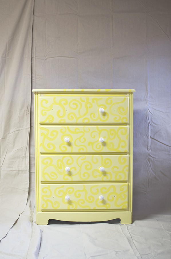
Josephine before picture

This little darling had been painted quite a few times and needed to be fully stripped of all the old finishes. It took three different applications of stripper to get through everything.  See those curves on the bottom portion, I cut those off, because “C” prefers straight lines. You will be able to see that in the after photo’s.  “Josephine” is the perfect combination of classy, modern and vintage.  I think this furniture makeover will surpass the nursery stage of  baby “C” and carry him/her through the teen years at least.
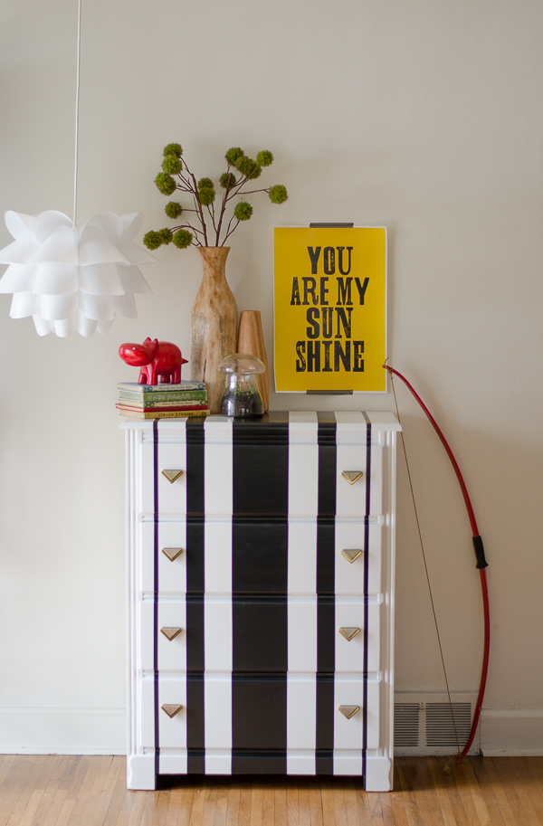
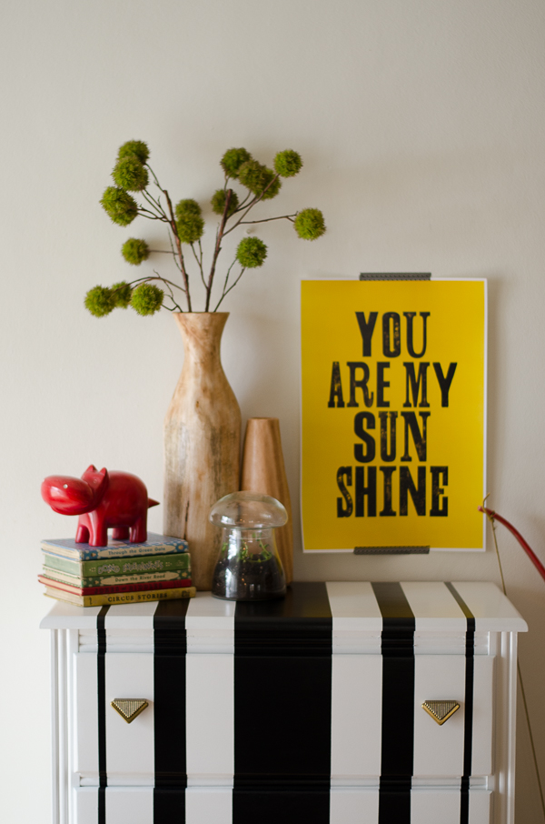
Josephine modern striped dresser

Vertically striped dresser

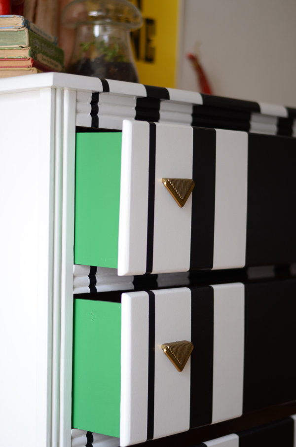
Dresser with vertical stripes and a peak a boo green on the side of the drawers

The drawers aren’t lined with paper, but I did paint and seal the drawer sides with this fun pop of green.
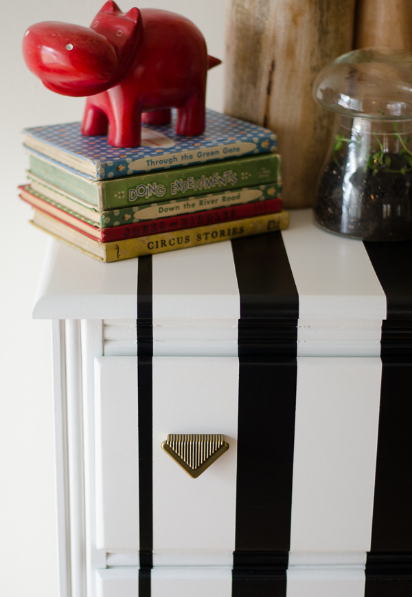
Art deco arrow pulls

The hardware is awesome and “C” picked them out, before I did the designs.  They are solid brass  pulls in the “Art Deco” style.  They really complete the design.  If “C” had picked round pulls or rectangular pulls,  I don’t believe this design would have happened.  A little advice, if you feel inspired to do vertical stripes after this post:  Take your time, and measure, measure, measure.  If you have the choice, go with a piece that has inset drawers.  Trust me!  The vintage books, red hippo (I absolutely adore it, love it, covet it) , and bow were provided by “C.”  The modern “You are my sunshine” print is from The Motivated Type.  Hanging light is from Ikea, and the wood vase’s are from West Elm.  I’m also redoing a child size table and chairs for “C” and I hope to have the before and after pictures up this friday.

Meg


Oh My Darling…”Amelia”

Hand painted in a custom milk paint color chest of drawers with coral floral knobs Amelia 007

Custom soft blue-green milk paint chest of drawers 064

Coral floral knobs Amelia 012

Amelia custom milk paint color with coral floral knobs 022

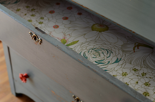
Amelia floral lined drawers and coral knobs 067

Months ago I picked up this very old oak chest of drawers at an auction. The oak boards on the top had separated leaving an irregular gap along the top and the drawers would fall forward if you pulled them out  just far enough to get into them.  I started to make the repairs, but other projects kept creeping in so I outsourced the repairs to a local woodworking company I’ve used previously. About a week later, she was back and ready for me to put my design ideas to the test.

She is hand painted in a custom blue-green milk paint and sealed with 3 coats of satin poly.  The color is what I call an uncertain color.  The light hits it and sometimes it appears as a shade of  blue and other times green.  I love those kind of colors.  The coral floral knobs add texture and a certain sweetness to the piece.  Her drawers are lined with graphic floral paper that I just couldn’t resist.  The paper has shades of blue, green, and coral, which compliments the exterior design perfectly. She is my darling “Amelia.”

I wish you could experience how smooth the finish is and yet how the oak grain still comes through.  It is seems so natural, almost as if the paint and the wood are one. The wood purists may be angry that I painted this oak piece, but I think the oak is happy again.  If I had been blessed with a little girl, I would have loved to decorate her room with this piece.

“Amelia” will be for sale ($450) in my Etsy Shop later this week.  Linking up at Miss Mustard Seed’s Furniture Feature Friday.

Dimensions:

  • 42 inches long
  • 18 1/4 inches deep
  • 30 3/4 inches tall

xoxo,

Meg


Master bedroom design board for Jordan

This post if for my girl Jordan!  She is one of my best friends and I love her dearly.  If I want fashion advice, life advice, to vent, or to laugh until it hurts…she is my girl!  She has been redecorating her home over the past couple years and I’ve been helping. Recently, she wanted to tackle her master bedroom.  She loved the deep blue in “Tallulah”, but wasn’t sure how to incorporate it into her home. She uses yellow and turquoise/aqua/teal accents in her home and she wanted to use them in the master bedroom as well.  I told her she could use the vibrant blue in her master bedroom along with her usual accent colors.  She didn’t believe me… until I showed her this picture.

Living room by Emily Henderson Via

I believe this room was done by Emily Henderson, but I couldn’t find a picture of it on her website.  If it’s not an Emily Henderson design, I’m sorry.

Once she believed me, we set out to find her some new furniture.  Her bedside tables were quite small and we knew those would be the easiest to replace the quickest.  A few weeks later she found some wonderful side tables that would be perfect as bedside tables in her master bedroom but they needed a lot of love.  I forgot to take a before picture,  but here they are after I painted them in a vibrant blue.

Blue bedsite tables

Now these tables are from two different  time periods but painting them the same color ties them together wonderfully.  Don’t you think? Their names are “Jamie” and “Claire.”  Jordan and I both share a passion for reading, so the names come from a series we are currently reading.

Now Jordan is a visual person (me too), and  I wanted to make her a design board for her room so she that she might have a more solid idea of what her bedroom could look like.  Jordan’s style is cheerful and a bit rustic -cottage-y.  Here you go Jordan!  I hope you like it!

Jordan's Master Bedroom
You can see all the item sources by following the link above to my polyvore board.
Here is a little insight into why I chose these pieces for Jordan.
1.  These curtains are similar to ones that she already owns and incorporate the turquoise/aqua color.
2. The headboard is also similar to the one she already owns…but if she is feeling the urge to DIY a new headboard or complete bed…here is a great tutorial from Ana White. My suggestion is to use a better quality hard wood that can be stained.  With the vibrant blue side tables and aqua curtains she needs some wood to balance it out on that side of the room.
3.  Her new side tables redone by me.
4.  Sconces from Urban Outfitters to be mounted beside the headboard so they don’t take up room on her new bedside tables.
5.  The yellow and white rug to bring that pop of yellow.  Although, this one is probably a budget breaker for most people but can be used as a guide.
6.  Date Artwork – because it’s sweet and might be a great reminder for the hubs.
7.  Jordan may be replacing her dresser and chest of drawers in the future and I felt that this one had a great finish that was still rustic but modern.  Jordan – keep an eye out for something similar.
8. Blue and white pillows with a geometric pattern to add a bit of the cottage/modern feel.
9. Deer head pillow because it’s whimsical and her husband is a hunter.
10.  Blue/teal throw.  I love how much texture this throw has and feel that it would look perfect at the foot of the bed.
She could always incorporate a mustard chest of drawers as well like the one here.
Jordan – I hope you love it!!!
xoxo
Meg